28.【Visualization】Viewing pn-Junction Band Structures with 3D Animation
tags: [“Semiconductor”, “pn Junction”, “Visualization”, “Python”, “matplotlib”]
What’s Hard to See in Static Diagrams? 🤔
In textbooks, pn-junction band diagrams are usually shown like this:
- Horizontal axis: position x
- Vertical axis: energy
However, in a real pn junction, multiple factors interact simultaneously:
- Applied bias Va
- Built-in potential Vbi
- Change in depletion width
As a result, the band structure
continuously deforms depending on conditions.
With static diagrams,
it is honestly difficult to grasp
this flow of change caused by varying conditions.
🎞 Viewing It as a 3D Animation
To address this, the pn-junction band structure was visualized in 3D:
Position × Bias × Energy
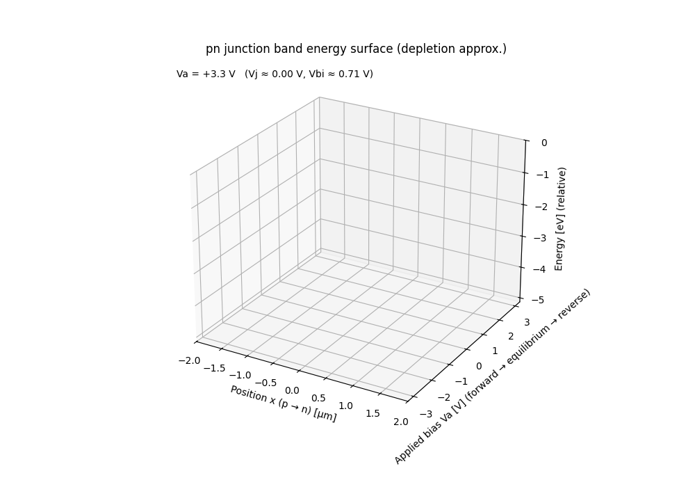
Meaning of Each Axis
- x-axis: position (p → n)
- y-axis: applied bias Va
- z-axis: energy (Ec / Ev)
👉 Instead of thinking
👉 “the band bends”,
👉 you can intuitively see that
👉 an energy surface moves as conditions change.
🧩 GIF Generation Code (Excerpt)
This GIF was generated using Python (matplotlib),
by incrementally adding bias conditions step by step.
from matplotlib.animation import FuncAnimation

ani = FuncAnimation(fig, update, frames=Nv, interval=200)
ani.save("pn_band_energy_surface.gif", writer="pillow", fps=5)
- Sweep Va
- Add energy surfaces sequentially
- Build up a growing 3D surface
📌 The key point:
📌 This is not an animation of rotating a 3D plot,
📌 but an animation that accumulates conditions over time.
📎 Python Code Used
The full code used to generate the GIF is available here 👇
- pn-junction band structure 3D animation
https://github.com/Samizo-AITL/qiita-articles/blob/main/demos/gif_anim/pn_junction_band_surface_animation.py
Running it as-is will output
the same GIF used in this article.
✨ What This Visualization Aims to Convey
- What it really means for the depletion region to “expand”
- What it means for the barrier to “lower” under bias
The goal is to grasp these ideas
as mental images before diving into equations or text.
In the next article,
the same visualization approach will be applied to
control theory (P control) 👉